
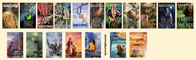


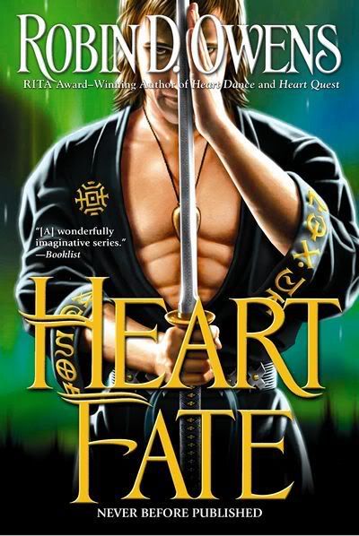
Heart Fate Cover
Since I needed it for the ad, I asked for it. Honest feedback is appreciated.
May you enjoy all the images of your day.
Robin
May you enjoy all the images of your day.
Robin

posted by FantasyAuthor RobinDOwens | 6:05 AM
![]()
19 Comments:
Whoa. The abs are....defined. I never thought of Tinne as quite that built, but I'll go with it!
Striking. I wish I could see more of his face, but I adore the sword and clothing. I'm with Kaite in that I always pictured Tinne as more streamlined...a runner's build, not a weight-lifter's build, but it is still a great cover.
Brenna
My first thought was that the abs are very fake looking and a little off putting. It is very Conan looking. Isn't Tinne a little young to have that well defined of a body? How long has it been since we first met him? He was around 19 wasn't he? I'm with the other ladies, Tinne was not quite so body builder looking in my mind.
I would have liked to have had Tinne's face and espcially his eyes highlighted more and the abs less. Tinne's eyes are perfectly placed in the D and O of your name. I love the drama that comes through in that part of the picture.
I will need to go back and look at the sword to see if it is like I pictured it being when T'Ash made it, I presume it is the same one?
I am looking forward to the book.
Tine
Tinne is 23, so he is a little...less, on the other hand, he is a fighter, has been a fighter all his life and I often refer to his muscular body (but don't think I'll use "abs", usually Lahsin is looking at him from the back ;) )
I'll put up some City of Heroes pics I made and sent to my editor.
The sword is not mentioned in the book, though I suppose I could do so, but am not too inclined...hmmm just thought of a good spot.
The sword would NOT be the same sword. I think Holm had the Heir's Sword (will check), and since he is now the Heir once again, he would have that sword. I recall making a main gauche for Tinne but have not mentioned that, either.
So I think I've covered the sword topic here...
I think I know what you're getting at, Robin. I suppose that my problem is my SCA time. Heavy fighters (the guys in armor and carrying broadswords) are often bulky guys, but the rapiers/light fighters (the guys who depend on speed and dexterity more than brute strength and armor) are often lithe, slimmer of build, even after years of training at it. From reading about their training, both the grappling and swordplay, I always pictured Tinne as a light. You're picturing him as a heavy. He's your character, so I defer entirely to your mindset of him.
Funny story time. Cariadoc of the Bow and McBrand (I believe it was) had a bet on whether a light or heavy would win in a battle. Hands down, the light won, every time. He was so agile (considering he had no heavy armor weighing him down), the heavy couldn't touch him. McBrand would just dance around him and lay blows at the breaks in his armor. Of course, had the heavy landed a single blow, the light would have been down, since he had only padding and not armor.
Brenna
Brenna, I actually see Tinne as lighter (as pics tomorrow will show), but the artist didn't. Well muscled, and muscular, but not heavy.
Robin
It all just looks a bit dark to me. Abs are kind of cartoonish, and he looks kind of evil. Sorry. This cover doesn't do it for me.
I like the cover. He looks fit, not heavy, and comfortable with his sword. :D
Okay, I'll give my honest opinion.
Pretty much I agree that the abs are a bit overdefined. But other than that this is a yummy cover. Nice colors, just a hint of "bad boy" in the pose and who doesn't like a man with a big, long, wide, um... sword in his hand.
Cheers,
Janet/Cricket
I agree with the abs being over the top. The eyes in the letters of your name are perfect. I like a bit left to my imagination what the character looks like, so while the face isn't exactly obscured, it's not *complete*. I do like the colors and layout.
I like the overall concept and the colors, but it's not my favorite cover.
Maybe it's the abs, maybe it's the continuing theme of a guy with his shirt cut down to his navel... It just doesn't fit my mental image of what the characters would actually wear. (Although, this one is kind of borderline, since I can see it as something that might be worn to a gym/salon to train.)
Plus, to me, it would be something I'd feel a little self-conscious reading in public (on a plane, in a waiting room). Not that it would truly stop me, as I'm dying to read what's inside. :)
Laurie
If you look at Olimpic Fencers' photos, it can be seen that they are not built like wrestlers/beef cake. Brenna got it right: David is more attractive than Goliah and Apolo more than Hercules. All that meat is only for show: I have seen a professional Bodybuilder/ wrestler not last a day working at a construction site and doing half as the slimmer guys did.
I thought that Tinne was ash blond?
If the sword is really sharp that hand would risk being shredded.
This is the same comment I posted on JDRobb yahoo group.
I like it ! The thing that struck me immediately was the house symbols on his robe. Then the position of his hand on the sword. Striking colors. Goes very well with the other covers. Is his Heart Gift on the cover ? Must go back and look closer.
But, yeah the abs are a tad bit too much. I think they may take away from an otherwise great cover.
Jill
I have mixed reaction to the cover. I like the conception and the clean, striking look of it, but it's definitely not how I pictured Tinne. The face just seems all wrong somehow.
I think it will do well, though. It's definitely eye-catching!
-- Karen McCullough
I love the swirling blues and greens in the background on the cover. It reminds me of the Northern Lights and I do get the feeling of being outdoors in the picture.
My mom, who comes from above the Artic Circle, has always said that the lights make noise when the colors swirl across the sky. In looking at the cover, I can just hear the snap and crackle of the enery of Tinne.
Tine
This comment has been removed by the author.
I like the colors but do not enjoy the picture. I preferred the items as the cover versus the buff man. I prefer to form in my mind the picture of the person from the words versus a cover picture.
I am excited to know your next book is coming soon.
Thanks all. Note that in my pics to editor Tinne was not of the muscle bound type (and you can really have huge muscles in city of heroes), also, looks younger. The age of the face bothers me...and his hair should be white blond...so thanks for all the input!
Robin
Im new to this series but since the beginning when Tinne is introduced i saw him with a lighter build, in fact the cover of Heart Dance is my favorite because thats how i picture him. I agree with brenna, a runner or dancers body.
Post a Comment
<< Home