
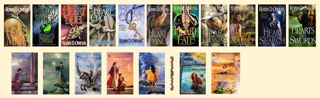


Cover Art
Cover art is on my mind for a couple of reasons – Heart Choice is coming out and the cover is my least favorite and the print run is being upped from my last run (I think I'll talk about print runs one day next week). Covers sell books and I, as usual, want Heart Choice to sell well. My aim here is to be able to quit my day job and work on my writing (and writing is WORK). I can't quite do that yet. I'm single with cats, which means I support myself and cats. I'd also like to have enough money to travel, a cushion for my own emergencies, and enough to help out my family when necessary.
The second reason is that I'm going to see my old roomie and her husband today. She frames all my cover art (well, she won't frame What Dreams May Come because that's not entirely mine and I have ideas about it for myself). I'll be getting Guardian of Honor and Heart Choice today and I'm excited. My art hangs in my entry way and is starting to march up the staircase wall.
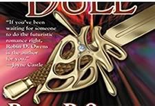
Anyway, I missed my editor's telephone call about the art meeting for Heart Duel. I had ideas of a big pink pearl heart floating over a labyrinth at night (and I made them up, too). My editor thought a sword and since I didn't give my input (which isn't always great anyway), I soon got an email asking for swords. So I searched the net and sent them about nine swords, as well as a picture called "anatomy of a sword." You can see that the art department "futurized" one of the pics I sent them above.
I didn't have the cover art when I turned in my manuscript and I knew there was a sword on the cover, so when I decided it was the right time to describe the cover, I did this [describe sword on cover here]. My editor said I freaked my copy editor out on that one – and since (s)he freaks me out every time I see the puncutation (s)he inserts, I laughed.
Then I got the cover art. It had a big round diamond in the middle and was very bright. I loved it. I put it up all over the web and sent it to amazon and insert the proper description into the book (it's where Holm gives his father the Heir's sword, near the end of the book). In fact, it's the one up here – third from the right.
When I got the cover flat itself, instead of the diamond, it had something like a red boomerang, and the addition of the metallic portion made it less bright, and made the nice white lettering of my very important cover quote from Jayne Castle (Jayne Ann Krentz) gray. I changed the sword's description in the page proofs. When the actual cover came out, they'd fixed the lettering back to white, but taken away the embossing of the sword, which was originally more three dimensional. So it goes.
My ex-roomie framed the cover art I'd recieved along with the front of the cover flat. I know that the whole cover of Guardian will be framed because the picture continues with the city in sunshine (Denver) on the back, along with a peacock (which I think is my shapeshifter Sinafin, though she was originally a big white – then red – bird) contrasting with the darkened clouds hovering over Alexa and the pool in Lladrana on the front. I can hardly wait to see my new art piece.
Love to all,
Robin
posted by FantasyAuthor RobinDOwens | 6:14 AM
![]()
5 Comments:
Robin, I think the covers are awesome. I especially love the Heart Duel cover because a sword for a duel works!
I can understand wanting the jewel tones -- you like them, gems are all connected with heartmate bonding, and it lends itself to "branding" in your reader's mind. But I don't think the HeartChoice cover is really out of line.
It may not be aas "flashy" perse, but I think the bracelet is elegant in its understatement. Classy.
I think it's beautiful.
And Straif could give me anything (even a cold stare) and I would be happy.
LOL!
Terri
They are lovely covers :) It's fascinating to hear about the process involved.
I have loved all the books covers - They have great colors and dimentions -Tammie
Thanks, ladies! You relieve my mind. Of course neurotic writer is redundant...
Robin
Catie, I had her as a white bird in the ms., then they put her on the original cover as a red bird, then, I guess, as a peacock. She is, of course, female. However, I had fun with this in Sorceress of Faith.
Post a Comment
<< Home