


Art & Inspiration
Sorry, folks, I was up at 5:45 am but Comcast wasn't. :( Denver had an outage that wasn't fixed before I had to leave for my in-person critique group -- and, yes, you will hear stuff about critique group again this month tomorrow. Plumber is here fixing 2 leaks from the tub and coping with wasps who found a way in to nest...eeeek!
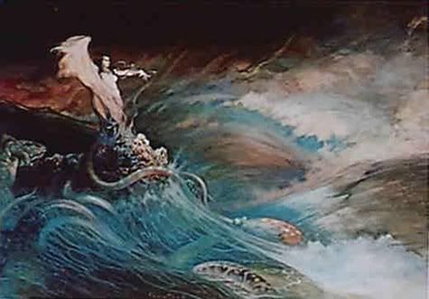
Regarding the cover art for Sorceress of Faith, I must admit I was thinking more like something above, Frank Frazetta’s Sea Witch. I have a print on an old calendar somewhere of this one. Images DO stick with me. In fact, like I said before, most of my inspiration comes from physical objects (I’m tactile), but visual will do just fine. I had this image in the back of my mind when I wrote Sorceress and the “land that calls to her” is by the sea and when she raises her Tower (the last thing a Circlet must do to prove they’re adept), she feels sea spray.
And I LOVE the cover for Sorceress – but compared to the above it looks very calm and (ahem) static… Note the energy in Frazetta’s print. Of course, I don’t know if “energy” would sell books…
Anyway I have ideas for Knight Protector and will be sending that art later…mostly Ciro Marchetti’s Knights in his Gilded Tarot and Dream Tarot, and Nene Thomas’ Carousel Horses (I have the brown print and love it).
Robin
posted by FantasyAuthor RobinDOwens | 2:22 PM
![]()
2 Comments:
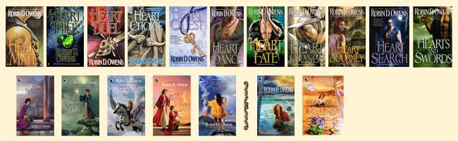
I wanted to mention the nice visual poetry you've set up with the arrangement of colors, variation in crispness, and imagery there.
If they were sounds, Mate and Duel's hot jewel tones would strongly rhyme with one another, with a complementary echo from Thief's very cold jewel tones, and would have assonance without rhyme from the subdued hot jewel tones of Dreams.
The misty colors of Dream, Honor, and Faith strongly rhyme with one another too.
The greens of Thief soften to surround Faith while the light behind Mate intensifies and focuses in Duel and then blends together in the swirling mist of dreams--on the other side of which is Honor.
The gold tones (and the filigree hearts) of Duel and Choice echo. Thief and Choice share a concrete feel the others surrender, while Thief, Duel, and Choice share a kind of consonance from their crisp "still life" rendering. The man in Dream looks like a closeup of the man in Mate, and raises an implication that he is the dreamer while Faith and Honor are his Dreams--especially with the use of the sun unoccluded on Mate and behind the clouds of Faith and Honor, and with the rec and violet behind Mate swirling about Dream.
The full-figure renderings of people on Faith and Honor circle back to the full-figure of Mate, giving a nicely complete feel.
Just rambling. Sorry
Please don't say you're sorry! It's lovely that you look at this with an artist's eye. All of my covers are framed by an old friend of mine, and I actually arranged them (she hasn't seen the latest arrangement yet) in a way that is pleasing to me.
The model for the man in Dreams is a noted male model (John de Salvo), and he has a great face -- but he isn't the hero of my novella since Jake is blond...but that's me thinking as author.
When I do my own "artwork" I have to restrain myself -- I'm thinking of a cornell box I did that looks a lot like a Mexican shrine...jammed with stuff and my box is pretty tacky...;)
So thank you for the insight into the covers.
Post a Comment
<< Home